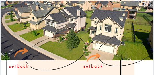
Setbacks are one of those design principles that are so obvious in our cities that we don’t even see them. They are a design requirement that forces developers to leave a certain amount of land in front of and around their buildings.
Why this matters: If your city struggles with affordable housing, zoning rules that require setbacks could be part of the problem
Setbacks require developers leave a certain amount of space unused, driving up the cost of their building and ultimately, driving up the cost of the finished product. Aesthetically, setbacks are the reason why old cities and new cities look different. In old buildings, entrances are right next to the sidewalk and buildings sit right next to each other.
Here are some examples:

Older European residential street design 
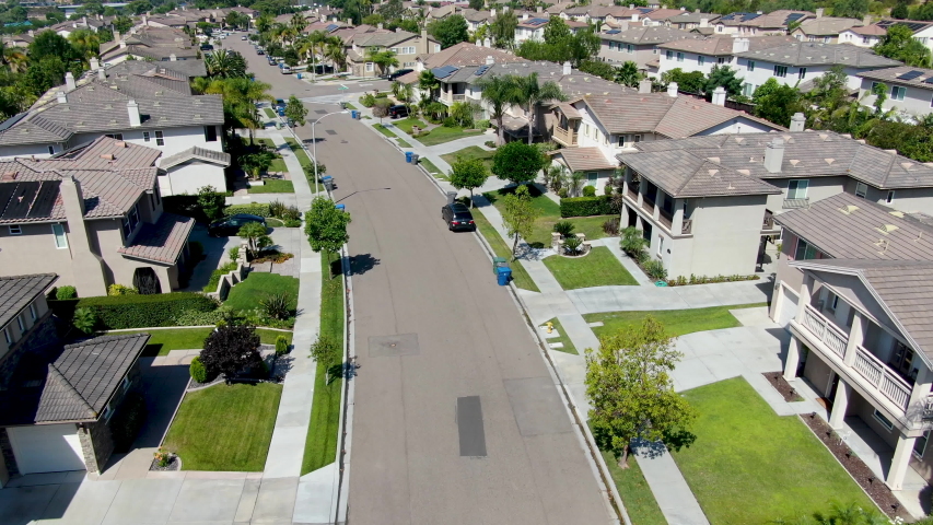
American suburban design 
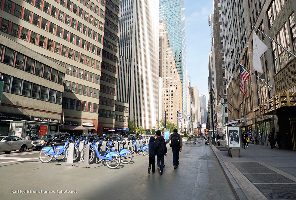
Commercial setbacks 
West Village residential 
West Village commercial pre-setback 
Suburban commercial (look at the distance between the door and the street)
Two quick notes on why they emerged:
1. An ideological emphasis on privacy and space as a response to the rapid urbanization of the 20th century
2. An attempt to price out certain groups of people. Requiring setbacks drove up the cost and price of homes, which had the effect of keeping these neighborhoods for the wealthy (until they became a universal standard of zoning and design in U.S. cities).
Setbacks have serious implications for affordability and equity in our cities especially as it pertains to providing more affordable and missing-middle housing. If you’re curious to know more about the history and disadvantages of setbacks as a design requirement, read the following articles:
“A Brief History of Setbacks” by Andrew Price for StrongTowns: True to its name, this is a super brief overview of the relationship between setbacks and early American suburbia.
“The Problem With Setbacks” by Andrew Price for StrongTowns: Provides helpful visualizations showing how requiring setbacks incentivizes larger developments and more expensive projects.
“Urban Design Gone Wrong: Setbacks” by Lucy Wallwork: I agree with Lucy that we should make close cities legal. I think consumers should have the freedom to choose either a home with space, but they should also have exposure to a “close” option that allows them to save money.
Happy reading!
P.S. Check out this cute little guide I made on setbacks for Instagram.
